Components overview

User interface components in VR are often similar to the 2D equivalents we are all familiar with, but with a few notable differences. They are often more three dimensional and buttons and controls are often raised off the panel surface like mechanical buttons in real life. Components also respond noticeably to proximity and touch from hands with motion, audio and visual state changes.

Ultraleap recommends the following, general-purpose components as suitable for most applications.

Panels

UI panel
../../_images/recommended.png
../../_images/Components-Overview-UI-Panel.png

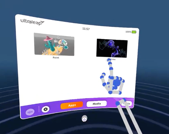
A re-positionable panel that sits in 3D space in the environment, and can be used with either direct or distance selection. Can be activated through a variety of means.

System / shortcut panel
../../_images/recommended.png
../../_images/Components-Overview-System-shortcut-panel.png

A smaller version of the above, tailored for regularly-accessed shortcut actions. Also suitable for use as a system menu.

Hand panel
../../_images/recommended.png
../../_images/Components-Overview-hand-panel.png

A small panel that appears anchored next to the users’ hand. Triggered by turning the palm towards the face from rest position

Keyboard
../../_images/recommended.png
../../_images/Components-Overview-keyboard.png

A re-positionable keyboard, suitable for short text entry such as passwords.

Help and tutorials

Simple hint
../../_images/recommended.png
../../_images/Components-Overview-simple-hint.png

A small text prompt that can be used to draw attention and introduce learned interactions

Help panel
../../_images/recommended.png
../../_images/Components-Overview-help-panel.png

A small UI panel that can be brought up at any time to present context-sensitive tutorial content

Components

Button
../../_images/recommended.png
../../_images/Components-Overview-button.png

A general purpose button for use on UI panels on in environment

Palm button
../../_images/recommended.png
../../_images/Components-Overview-palm-button1.png

A button positioned on the palm, typically used for quick access to features through a hand panel

Toggle switch
../../_images/recommended.png
../../_images/Components-Overview-toggle-switch.png

A re-positionable keyboard, suitable for short text entry such as passwords

Slider
../../_images/recommended.png
../../_images/Components-Overview-slider.png

Similar to the toggle switch, but allows users to move between a smooth range of values or multiple, distinct states

Carousel
../../_images/recommended.png
../../_images/Components-Overview-carousel.png

For presenting horizontally scrolling content on UI panels. Used with a swipe gesture

Micro handle
../../_images/recommended.png
../../_images/Components-Overview-micro-handle.png

Small, grabbable components, serving as pull-cords or handles for use with other 3D components

Turntable
../../_images/recommended.png
../../_images/Components-Overview-turntable.png

A 3D component which can be rotated and spun

Objects

Free object
../../_images/recommended.png
../../_images/Components-Overview-free-object.png

Free objects in the environment which can be picked up in the hand, moved, dropped and thrown

Handle object
../../_images/recommended.png
../../_images/Components-Overview-handle-object.png

Free objects which feature handles which hands may snap to when grabbed

Mounted object
../../_images/recommended.png
../../_images/Components-Overview-mounted-object.png

A 3D component which can be pushed and pulled, but is mounted in the environment with some axes of motion locked


Want to learn more about features in the game engine of your choice? Check out the implementation guides:

Back to top