Inside the Design of Our VR Barista Training Demo
We recently started exploring how we can improve VR training through physical interaction. We developed a VR barista training application with Ultraleap hand tracking - no controllers required. Trainees interact just how they would in real life.
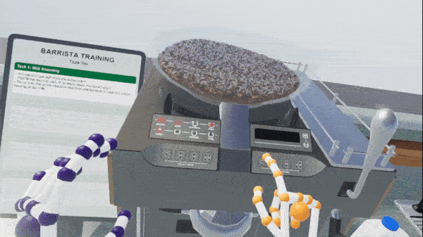
This demo shows how a VR training application can be made entirely with Ultraleap hand tracking - no controllers required. Trainees interact just how they would in real life
Cutting Edge VR Training Design
Adding hand tracking to these simulations puts us at the cutting edge of VR training design (read our Ebook for a guide to immersive learning and its benefits). Innovating in previously unexplored territory is awesome but challenging. There is no guide to the simulated galaxy. So when faced with design decisions around using hand tracking, we are forging our own path and finding out works best along the way.
This Q&A with the team behind the barista simulator covers what they did – what questions they asked to get started as designers, and what interactions they needed to implement as developers. How did they build an interactive training world, and how did they guide the user?
The barista training scenario is typical of the kind of experiences our customers are building, but in fact many other types of training can be delivered with the same or similar design.
This demo guides users through a procedural (step by step) learning process with in-world prompts, learning to use equipment and machinery with realistic hand actions such as grabbing, and monitor their progress with an in-world interface presented on a countertop screen.
Where did you start?
What did it take to go from a blank page to a realistic and immersive interactive training environment?
Matt Corrall, Design Director, Spatial Interaction
When we started designing the training application, we considered both the user and the context of use. This was an important first step that influenced which interactions and UI we built in. Training applications do not use the same interactions across the board, they vary by scenario, user type and the goals of the training. But in the case of procedural training the stuff we show here is going to be pretty typical for most customers.
Before we began, there were some fundamental questions we asked that informed the interactions the team implemented.
Questions we asked
How frequently (and for how long) will users interact with the training app?
This impacts the user’s capacity for learning new interactions. The less time they spend with it, the simpler and fewer the interactions need to be. The training app that Lufthansa use, for example, times user performance so that app uses a very simple set of interactions.
What are users trying to achieve in the training app?
Are they trying to remember the order of a procedure? If so, the interactions should be simple and forgiving so that users can focus on their primary goal of recalling the order of the task at hand. For example with the Lufthansa training app, we increased bounding boxes, removing the need for poses or realistic grabbing physics etc. This was because the learning goal was around flight safety procedures, not discrete actions.
Are they trying to build muscle memory for a task? Here, more realistic interactions will be important for the user and users may need to be more accurate when interacting with virtual objects. The barista training used realistic grab physics because users needed to practice the actions themselves- sometimes with many run throughs. It was appropriate to make the interactions more realistic whilst allowing for a little more learning curve.
What interactions did you need to implement?
Daniel Griffiths, Creative Design Lead
In this case, barista training in a coffee shop, remembering the order of the procedure was the goal. We started by building out a storyline so we could work out what the individual tasks were.
We actually found some great barista training videos on YouTube. So from there we could see exactly what’s involved in the training required from start to finish.
We started with the high level stuff - what does the user need to do? Get the cup ready. We then broke that down into the tasks needed to achieve that goal. Pick up the cup, tear off a label, put the label on the cup, write on the label etc.
Once we’d done that for all the activities the user needed to be trained on, we started to see what they key interactions were for the entire scenario - grasping objects, rotating objects, pushing/pulling a lever, pressing buttons and so on. This also helped us understand what the world needed to look like for the user.
What was the decision-making process for how to guide the user through the task list?
Daniel Griffiths, Creative Design Lead
At this point we were building the task list and the thinking was that we would use a tutorial mascot. A cute cup character or similar. We had a lot of fun with this – characters that guide you through a tutorial work really well, and in some applications are a good choice (we use one in our Blocks demo). But for this scenario we decided in-world prompts would best mimic the real-life setup. We wanted the in-world prompts to guide you, at the same time as helping you build a memory for the procedure.
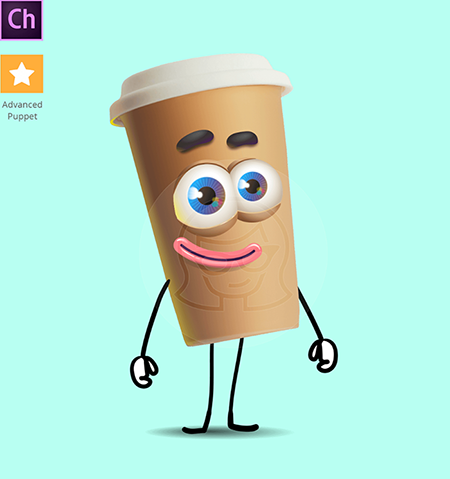
We all loved the idea of a little coffee buddy. But it wasn’t right for this scenario.
We next looked at virtually wearable menus. We love our wearable menus, they are super useful. They’re often necessary for bringing up UI panels and accessing more features than you have to hand at the start. They work really well for information that you don’t need constant access to - you can hide away layers and layers of information which can be great in a VR training scenario. In fact, the menus we prototyped to begin with were very similar to the ones used by Autodesk VRED, and the ones NMY used for the Lufthansa app.
But we realised we needed to think carefully about users’ potential to learn in quick, often time-sensitive sessions. Cabin crew might need a lot of information to refer to, but does a flat white need a full feature set? In this scenario, what we needed was a quick way to pull up a to do list and check your progress, without interrupting the flow of making drinks. So we started to think about simplifying the navigation even further and moving away from wearable menus. I asked the team to think about whether the task list, or even just the current task, could be displayed when you turn your hand over.
We wanted to make sure the user could still move between tasks easily. But we knew we wanted to move beyond a checklist that users had to refer back to. We can use checklists in real life! VR opens up limitless possibilities for new ways to design solutions to this problem.
Matt Corrall, Design Director, Spatial Interaction
One thing we’ve learnt is that under time pressure, people will want to be focused on what they’re doing in the environment, and just quickly glance at their task list before carrying on. The quicker that is to do, the better.
So designing the scenario to guide the user to the next steps was really important. We used a few tricks to grab the user’s attention, like putting a glow behind the next object to interact with, or using floating labels. This way it became very self directed. We also used audio cues to give the user feedback that they’re making all the right moves, and different audio cues if they’re making the wrong ones.
This is a huge advantage of VR training. We can place users in a very realistic environment to aid learning, but overlay prompts and highlights that nudge their attention towards the next thing they need to do. Small visual highlights and subtle animations are often enough to achieve this.
Lazlo Ring, Principal Software Engineer
We started to build out an indicator system for guiding the user through the tasks. The positioning was based on the bounds of the colliders in the object so, as you can below, you should just need to pass a reference of the game object near to it (if you’re familiar with our Unity plugin we simply called EnableIndicator with the indicator type and the target gameobject).
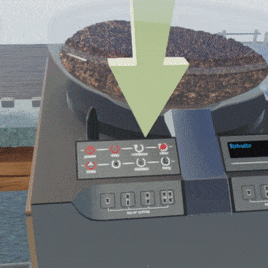
Initially we experimented with both big floating arrows, as well as more subtle indicators. As you can see in the video above, in the final app we used a combination of floating indicators and glowing outlines. For example you can see the glowing outline in use on the thermometer in the final demo.
The application is made in Unity, but some of the assets were purchased from a 3D online store. How are you able to interact with them?
Daniel Griffiths, Creative Design Lead
We built this in Unity and started shopping around for a coffee shop asset that we liked. We also found an espresso machine with good interactive elements (knobs for steam, buttons for different types of coffee etc.), as well as coffee cups and milk jugs. Things like that.
Other assets and visuals were created and adjusted in multiple applications such as Illustrator, Photoshop, Blender, and Substance Painter. We used the Interaction Engine in the Ultraleap Unity Plugin to add interaction physics to some of the elements. So for example, for the UI buttons on the coffee machine, we removed the original buttons from the asset, then added interactive buttons so that the tracked hands can interact with them.
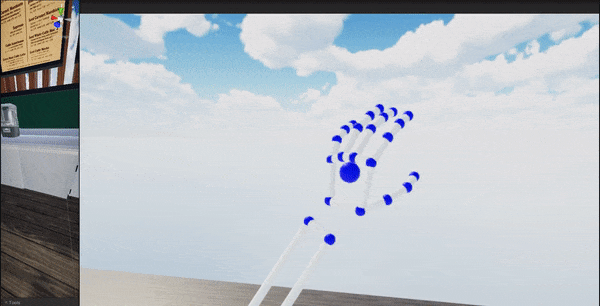
The Hands Module in the Ultraleap Unity plugin now incorporates arms as well as hands. So we can use full arms instead of floating hands. A big plus of using VR training is realism and immersion. But floating hands can break that immersion so this aspect was very important for us.
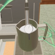
The Interaction Engine doing its thing for the buttons on the coffee machine
What other important features do I need? An exit or restart feature?
Matt Corrall, Design Director, Spatial Interaction
It’s important to make sure users have easy access to help at all times, as well as system-level controls such as ways to restart and exit the application.
Often the best place for these is in a wearable menu or UI panel, if you’re using them, because they can be called up at any time.
Another method is to use a memorable hand pose to trigger an action, such as exiting the application. In the barista demo, when users form and hold a triangle shape with both hands, they can exit the application. If you’re going to use hand poses, make sure they’re distinct. This is so user intent is clear and the action won’t be triggered accidentally when the user is doing something else.
Hand poses can be an excellent shortcut to important actions, but they should be introduced via some instruction or tutorial. The user will also need to remember them, so they’re best suited to applications where users will spend some time in the training scenario and have a chance to learn the pose over several uses.
Finally – what Ultraleap resources were used in the demo?
Move beyond…
Physics Hands in the Unity Preview Package
How To Get Started With The Hands Module
Want to stay in the loop on the latest Ultraleap updates? Sign up to our newsletter here.