UI Panels

UI panels are a core component of most VR applications, and are used to display app libraries, settings, webpages, videos, and other content. Whatever type of application you’re building, you will likely need some UI panels to access key features or display key content.
Direct vs Distant Interaction
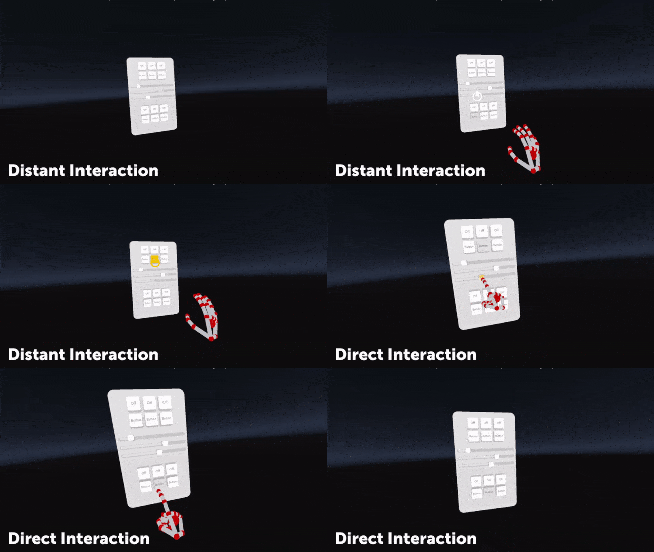
UI Panels can be interacted with both direct and distant interactions. Direct interaction acts in a similar manner to touchscreens - with hands making direct contact with the surface of the UI panel in order to interact. With distant interactions, users aim at the panel with a far-field ray, and pinch to simulate a “click”.
Direct interactions offer users more agency, but can often be more tiring when used for long periods of time. Distant interactions can be less intuitive, but require less movement than direct interaction, and so are more appropriate when interacting with UI panels for long amounts of time.
Optimising UI panels for hands
Much like virtual objects, UI panels work better with hands when they have a degree of depth and physicality, rather than being completely flat. Ultraleap recommend:
Buttons are raised off the panel surface by default, and when pressed by fingers, move towards the panel in response. Selected buttons should appear depressed - visibly closer to the panel surface.
At large sizes, and when using direct interaction, UI panels should be curved to keep all components within comfortable reach. Users should never have to fully extend their arm or stretch to reach any control.
Cursors on the panel surface should be used for distance interaction, but are not necessary for direct interaction, and should be avoided to minimise visual clutter.
Using objects with UI panels
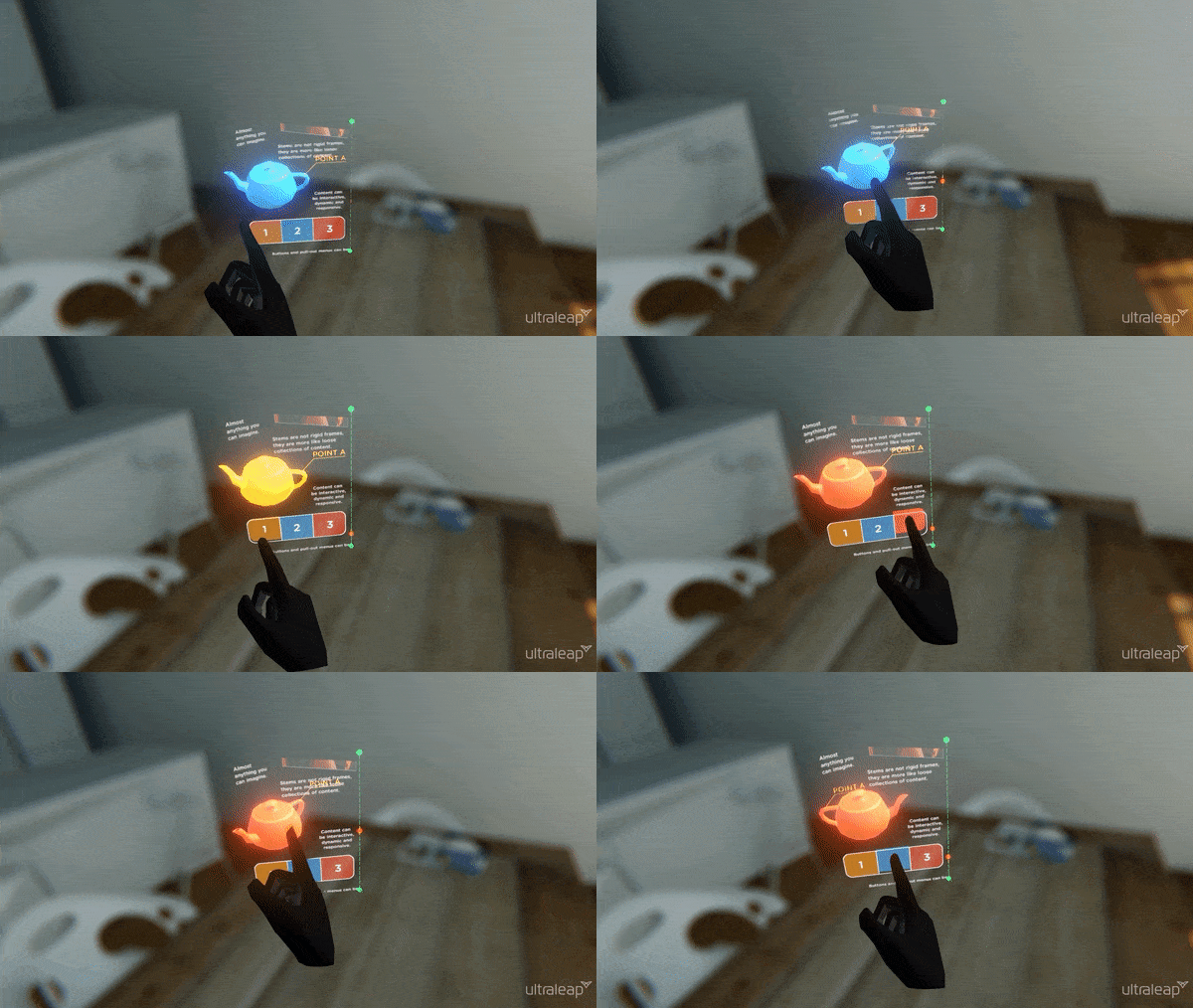
In VR, UI panels can be very versatile and take advantage of being in a three-dimensional space; not only featuring UI components such as buttons which have depth and motion, but even full 3D objects.
In this example, a mounted object is fixed to the panel, and can be rotated with a flick of a finger. Meanwhile, more common panel features such as buttons and scrolling pages can be used right alongside it.
Activating

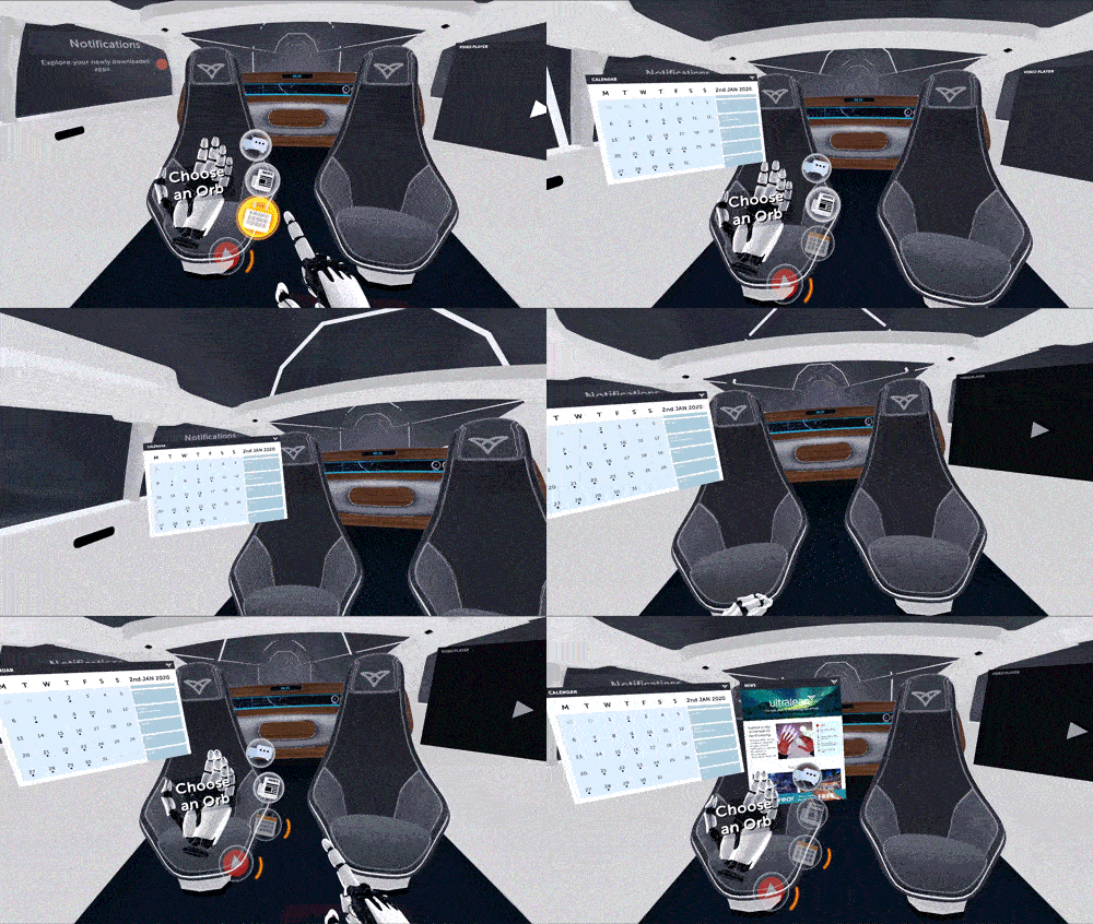
VR controllers typically use a dedicated button to bring up a UI menu panel. With hand tracking, a whole range of alternatives are possible, including spawning panels based on user location and interaction with key objects. To access a menu panel at any time, Ultraleap recommend:
Palm button
Opening via a Hand panel
Dedicated Hand pose
Scrolling pages
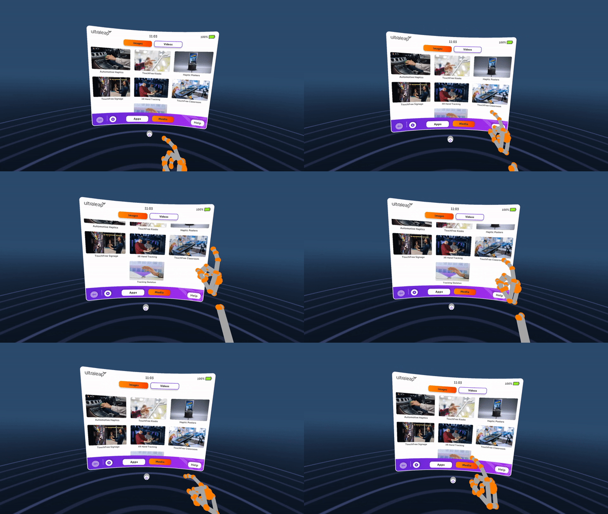
When using a UI panel, pages of content may need to be scrollable, much like a webpage. With direct interaction, all that’s necessary to scroll a page of content is to make contact on the surface with a finger, and drag up or down, similar to the way a touchscreen would work. This is easier and more natural than touching a small scrollbar, for example, and it does not interfere with the operation of the components on the page.
It’s important that it’s clear to users that more content is available below the fold, so they know the page on the panel is scrollable. Ultraleap also recommend a visible scrollbar to the right side, and if possible, content that’s cropped off at the bottom of the page.
Ultraleap recommend adding scrolling functionality to the page itself, rather than making the scrollbar the interactive component, as this tends to be too small and difficult to hit with hands.
Repositioning
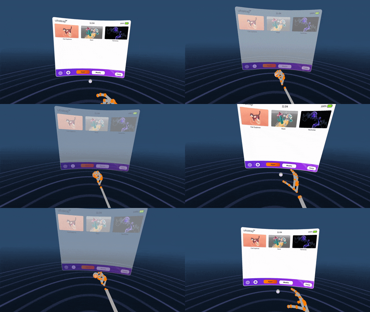
Users should be able to reposition any UI panel any time they want - this is particularly important with direct interaction, where they must be able to reach every component on the panel comfortably, without fully extending their arm.
Ultraleap recommend a micro-handle at the base of the panel, which can be grabbed and used to move the panel to the desired position. This should be a small, round shape which looks like it can be grabbed easily with the fingers of one hand.
Whilst it’s also possible to achieve the same result by grabbing in the panel itself, this is less intuitive to users as there is no clear element to hold on to. It can also lead to accidental interactions with components on the panel surface.
Resizing
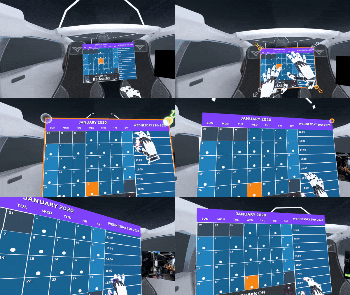
UI panels can also be enlarged and shrunk, by forming a pinch pose with both hands near or at the panel surface - then moving the hands apart to enlarge the panel, and closer together to shrink it.
As in this example, Ultraleap recommend clear visual feedback that the panel has entered a resizing mode when the pinch poses are detected. For example, by displaying round ‘nodes’ at each panel corner, accompanied by arrows indicating whether enlarging or shrinking is currently happening.
User discovery
Panel resizing require prompts to be discovered and understood quickly. Ultraleap recommend two simple hints for this:
A hint on both hands, that says “Pinch fingers together on both hands to resize” or similar.
Once pinch poses are held, a hint between both hands saying “Move hands closer or apart to resize” or similar.
System and Shortcut panels
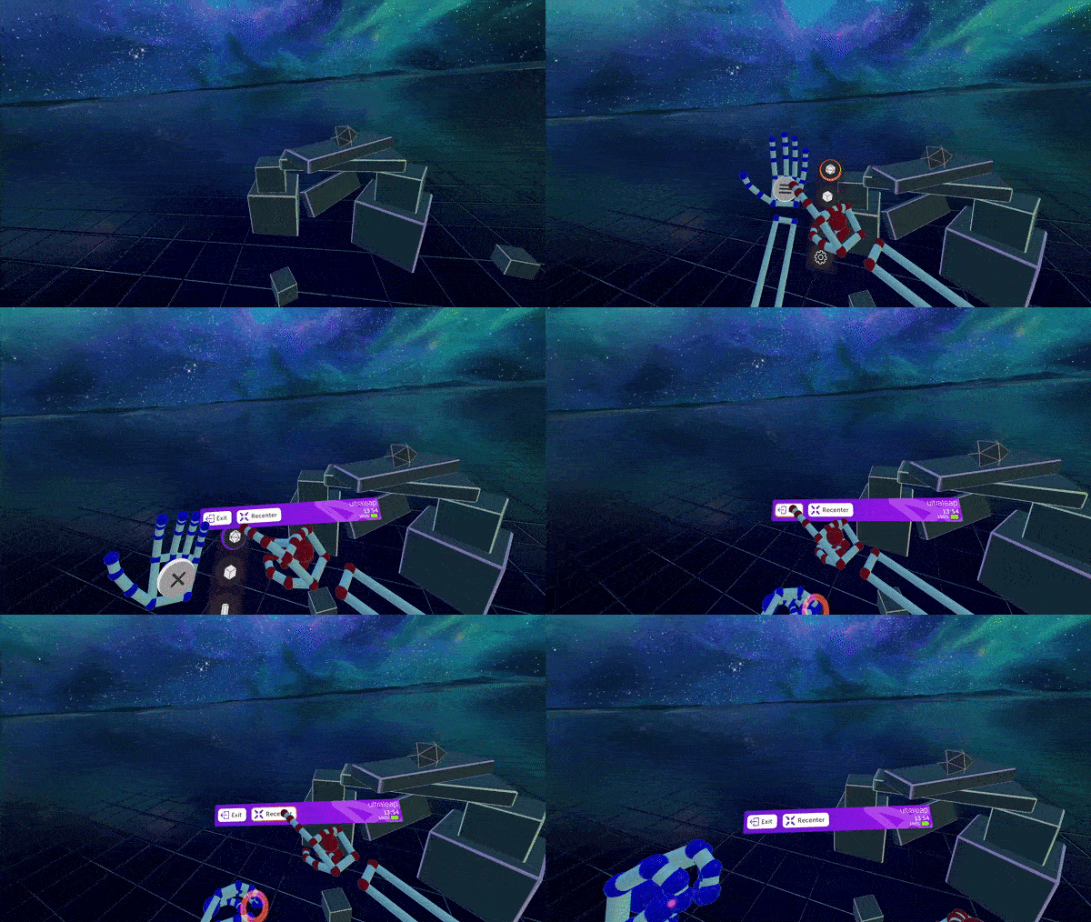
The same UI panel format can be used at a smaller size for creating headset system menus or shortcut panels, optimised for hand tracking.
A system menu is a small, persistent panel which is part of the headset’s operating system and should be accessible to users while in third-party applications. It allows users to control key headset functions like closing and opening an application, and settings like volume and WiFi connectivity. This is possible entirely with the hands using this panel format.
Shortcut panels may be part of a single application, but give users quick access to regularly used or central features, such as resetting view, changing virtual hands, or exiting application.
For both panel types, developers can use a small UI panel with a handful of components present - typically buttons, sliders or toggle switches with clear labelling and icons. As with larger UI panels, may also be appropriate to use a micro-handle at the panel base for repositioning.
System and shortcut panels should:
Be quick to access and dismiss, so users can change system settings with minimal interruption to their experience. Ultraleap recommend activating via a palm button, hand panel or hand pose.
Look and work consistently no matter which application users are in.
Follow the same principles as any UI Panel by being comfortably positioned and sized. Users should be able to reach every control on the panel without stretching or fully extending their arm.
Contain only a handful of features which users will need, and as such should require a few UI Components such as Buttons and Sliders.
Be immediately understandable, using UI Components with familiar icons (Wi-Fi, Bluetooth etc) and, text labels where an icon isn’t obvious by itself (Reset view, Exit application etc).
Want to learn more about implementing these features in the game engine of your choice? Check out the implementation guides:
Getting Started
Ultraleap’s UI Input Module is our recommended way to build UI panels optimised for hands - included in our XR plugins for Unity and Unreal.
Unfortunately, in our Unity Plugin, the UI Input Module is currently deprecated. Ultraleap are working on a new release which will be announced soon.

