UI Components
Buttons
Button Sizing
You can use TouchFree at any interaction to display ratio. It is important to consider the size of a button in relation to the amount the user’s hand can move.
In general, TouchFree interfaces work best with larger buttons but if limited for space, our smallest recommended button sizes are as follows:
Smallest button size between 20 x 20mm and 30 x 30mm of interaction area.
Spacing between buttons at least of 5 mm of interaction area.
Interaction area is the space that relates to how far the user can move their hand while retaining the cursor on screen.


Layout
If you have set up a 1:1 calibration with your screen, check that each element in your UI is in an area that is tracked by your camera. If some UI is not in a tracked area, there are a few actions you could consider:
Consider if the camera can be placed in an area where the whole screen is tracked
Move elements of your UI to a tracked area.
Calibrate the camera and screen to a non-1:1 setup.

Soft Snapping
Often button size is restricted by the amount of content on screen or visual hierarchy. In these situations, we recommend using snapping of the cursor when in vicinity of a small UI element, to snap the cursor to the centre.
We also recommend snapping on elements that are around the edges of the screen. This helps to combat visual parallax between the cursor and hand, making it easier to click buttons in difficult to reach places.

Hover States
Hover states are a fantastic way to increase engagement with UI, it makes the interface more usable, engaging, memorable and provides the opportunity to create more engaging content for your intractable elements. Hover states can also be used to improve experiences for traditional touchscreens by giving these traditionally static UI’s life and reactivity when the users hand is in proximity.

Progress to Click
In the real-world physical buttons move when pushed. With the AirPush and TouchPlane interactions, TouchFree can replicate this by calculating the user’s depth. When the user pushes an interactive button, consider signalling their progress to click. One way of doing this is by scaling the button down the further they press. This gives the impression of a 3D interface and provides the affordance that the user is pressing a physical button. Our research has found that this can be a fun and engaging experience, far more engaging than touch screen buttons.
Another way of showing progress to click is showing progress fill towards the edges of the button, communicating to the user that the button is being pressed. A radial fill emanating from the users click position gives the user a sense of agency and feels natural with a TouchFree experience.
For the Hover & Hold interaction, filling the perimeter of buttons to show a visual countdown works very well (see below).

Progress to click: 3D reactivity

Progress to click: Linear fill
Action Feedback
Users benefit from feedback on their actions, such as visual and/or auditory confirmation that a button has been pressed.
To aid with this both Air Push and Hover and Hold cursors animate when a button is pressed. Consider making further changes to visual and audio feedback to give users extra reassurance.
Ultraleap recommend:
Colour changes on button release
Button micro-animations on button release
Audio cues on button release
If you’re developing with TouchFree Tooling, you have complete control over how your interface reacts to a successful button press. You can also display click progress, hover states, cursor changes based on the underlying UI, and much, much more. Users can have optimal feedback for a wide of range of their actions.
Cursor
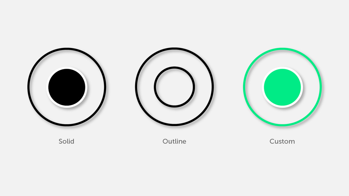
TouchFree Overlay Cursor
TouchFree Settings offers a default cursor in a ring format. The Settings application provides a number of presets designed to have high contrast against a variety of backgrounds. The colour, size and thickness of the cursor are customisable. Consider which style and colour works best on your interface. If the preset styles don’t suit your application, TouchFree Settings offers the ability to fully customise the colour, size and thickness.
Solid (Dark / Light)
Highest contrast, most noticeable
Outline (Dark / Light)
Most minimal, puts the focus on the content
Custom Colours
Enables you to fit the cursor style your brand and UI
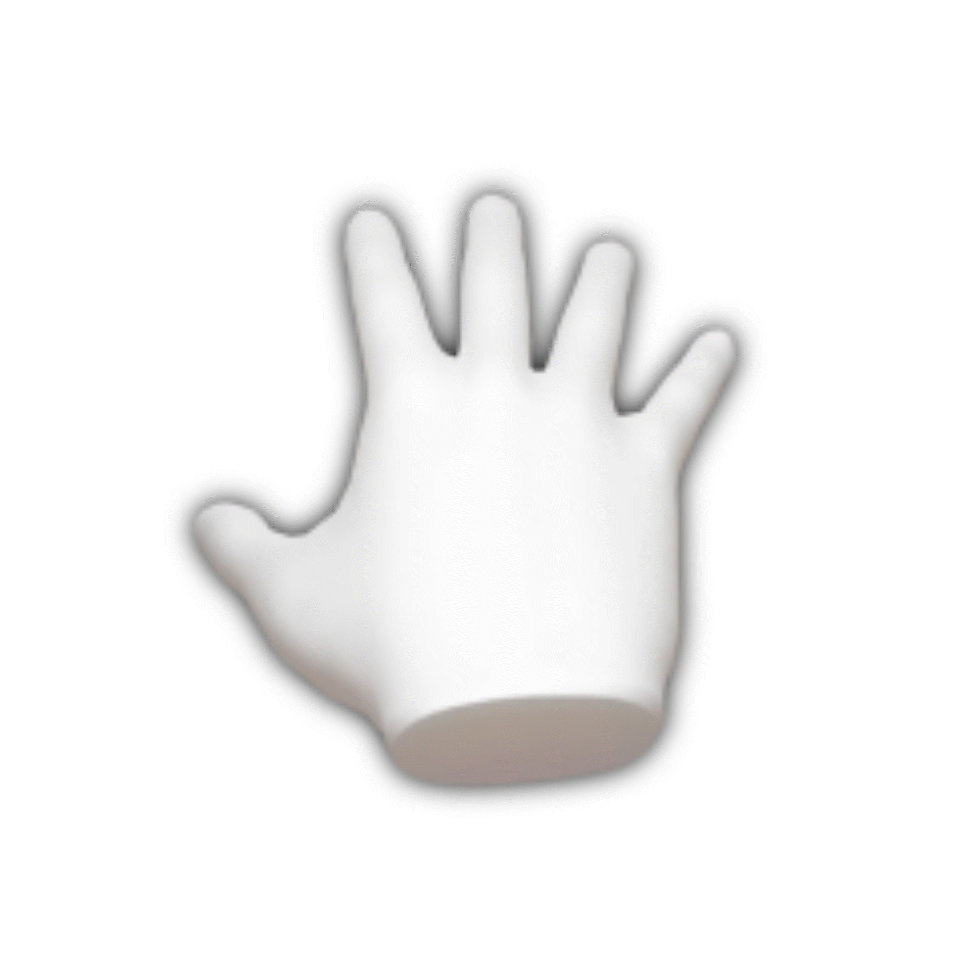
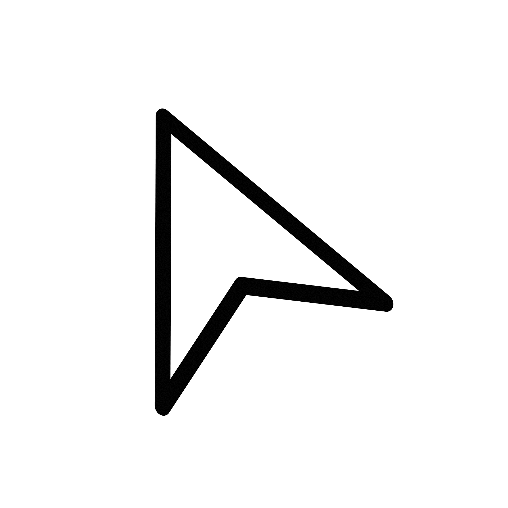
TouchFree Tooling Cursors
With TouchFree Tooling, you can create any kind of cursor that fits best with your application. These could be Arrows, Hands or any other graphics that suit your application. You can also quickly create progress to click animations that change state when approaching a click between 0-100%.
Examples
A clear visual state change is required when the user has pushed far enough forward and they must retract their hand for a confirmed click to occur with either AirPush or TouchPlane interaction.
We recommend changing colour of the cursor and scale on down event but you can use any clear state change such as changing cursor shape or an animation.
TouchFree Tooling: Direct Interaction
Interfaces feel best when the focus is on just that, the interface. Bringing focus to the buttons rather than cursor means people stop thinking about controlling a cursor and think about the content of your application instead.
To create a successful content first interface require a few best practices:
Show hand location when not over interactable content
It’s important that hand location is visually communicated on screen when in areas of the UI with no interactable content. If there is no visual feedback, users can feel lost or think that the system isn’t working when their hand is not over interactable content. We recommend representing the hand with a slight shadow, giving the user agency, as if their hand is casting the shadow on the interface.
Clear hover states
Hover states provide clear feedback that the users hand is in the correct location and brings the content front and centre.
Communicate hand location within elements
Users like to know the location of their hand within interactable content so they know how close they are to the centre or edge.
Magnetised content: Dynamically moving the interactable element in the direction of the users hand. Think of the interactable content as being magnetised slightly to the users hand. To aid the concept of magnetism, use a drop shadow that stays in the original position as the hand moves around the element.

Hand highlight: A small radial shadow or highlight can be used to communicate the location of the users hand within interactable content while keeping the content static in it’s original hover state.

Magnifying 2D and 3D content
Unlike touchscreen or mouse input, TouchFree is a 3D interaction. Enabling creators to make use of the distance between the hand and screen as well as x and y co-ordinates.
This can be used to create surprise and delight, engaging users with your content.
Dynamically scaling 2D or 3D content using the z axis enables users to have fine grain control of zoom levels while interacting in a natural way. Controlling content using 3D space encourages exploration and experimentation, transforming content into super fun and engaging experiences.