Tutorials, hints, and help
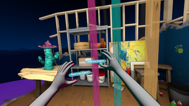
As intuitive as hand tracking experiences can be, there are often new interactions to learn and new types of UI components to try. Designing the right prompts and tutorials - at the right moments - is key to a good user experience.
Physical interactions such as object manipulation can often be picked up without explanation, however learned interactions, such as locomotion, must be taught. This requires a prompt or tutorial to let users know the interaction exists, draw attention to the correct hand or component and, if necessary, demonstrate what to do.
In choosing the right prompts and tutorials, it’s important to consider who your users are, their familiarity with VR and how often they will be using your application. Depending on the format of your application, it may be appropriate to begin with an onboarding tutorial that lets users practice interactions before they begin, or it may be better to introduce interactions gradually with step-by-step tutorials throughout the experience.
General tips for introducing interactions:
It can be hard to describe learned hand poses and gestures such as ‘pinch’ effectively with just words. Ultraleap recommend showing the action so users can copy it, as well as describing it in text or audio.
For elements affixed to the hands and wrists - such as a hand panel - it is often only necessary to draw user attention to them with a small prompt, rather than a full explanation.
Ultraleap recommend always including a help button or similar so users can bring back tutorials whenever they need them.
Simple hints
Included as a prefab in Ultraleap XR plugins.
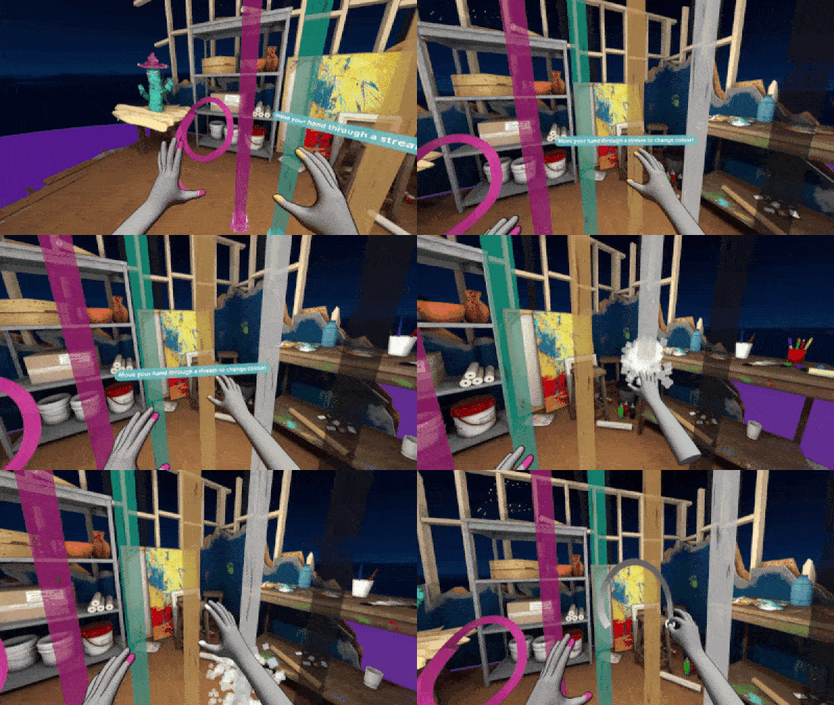
A short, simple text instruction that appears in a bubble. This instructs users to perform a simple action such as turning their hand to open a hand panel, or draws their attention to something (such as their wrist) where they can discover a locomotion element.
Simple hints are most effective at drawing attention to elements which are familiar, introducing physical interactions and UI components whose function can be understood upon sight. However, learned interactions require visuals.
Simple hints can be built to disappear once the intended action is performed. However, as it’s often possible for users to perform the intended action by accident - particularly as they are learning - Ultraleap recommend hints disappear after two or more successful actions. This helps avoid situations where users might accidentally dismiss prompts before they’re confident what’s happening.
Design tips
Simple hints are easier to spot and to read when presented on a background, as opposed to floating text in the environment. Ultraleap recommend small bubbles or boxes as shown above
Always choose high contrast colours for text and backgrounds that can be clearly seen against the environment. Ideally, choose a colour which is unique in the application and use it consistently so text bubbles can always be identified quickly when they appear.
Position hints close to the elements they refer to - hands or UI components - and ensure they can be seen clearly by users.
Pose tutorial
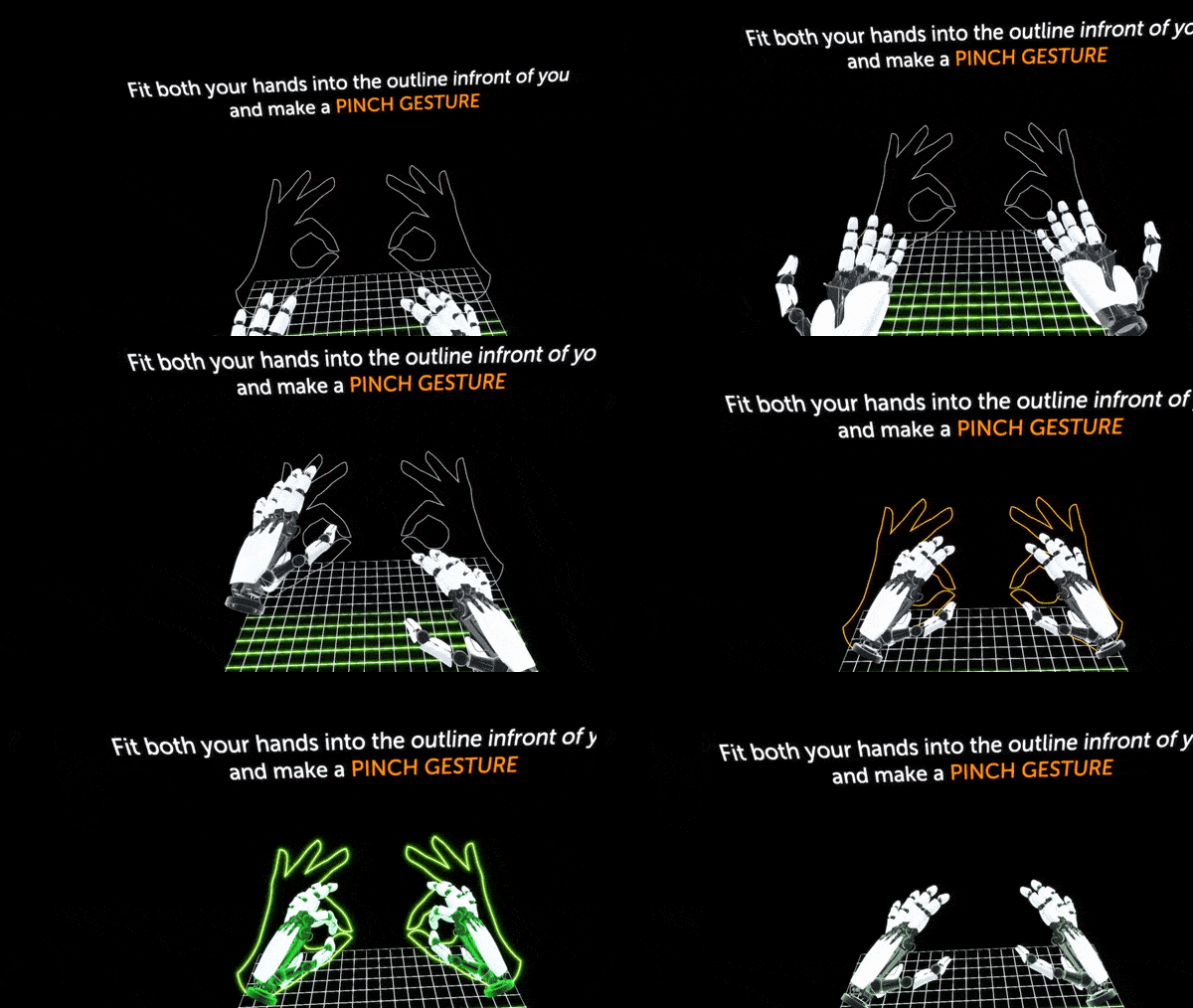
An interactive tutorial that teaches hand poses, and approximate positioning in the interaction zone.
Through text and an optional voiceover, this tutorial prompts users to perform a hand pose by placing their hands in outlines in the environment, teaching them both the pose and approximate positioning required. When the pose is performed correctly, the tutorial gives clear feedback by - for example - turning the outline elements green.
A pose tutorial can appear either at application start, or when introducing new chapters or sections where the pose will be used.
In this Ultraleap example the experience is momentarily paused and the tutorial becomes the only visible content. Any other interactions or elements are disabled until the tutorial is completed.
Component tutorial
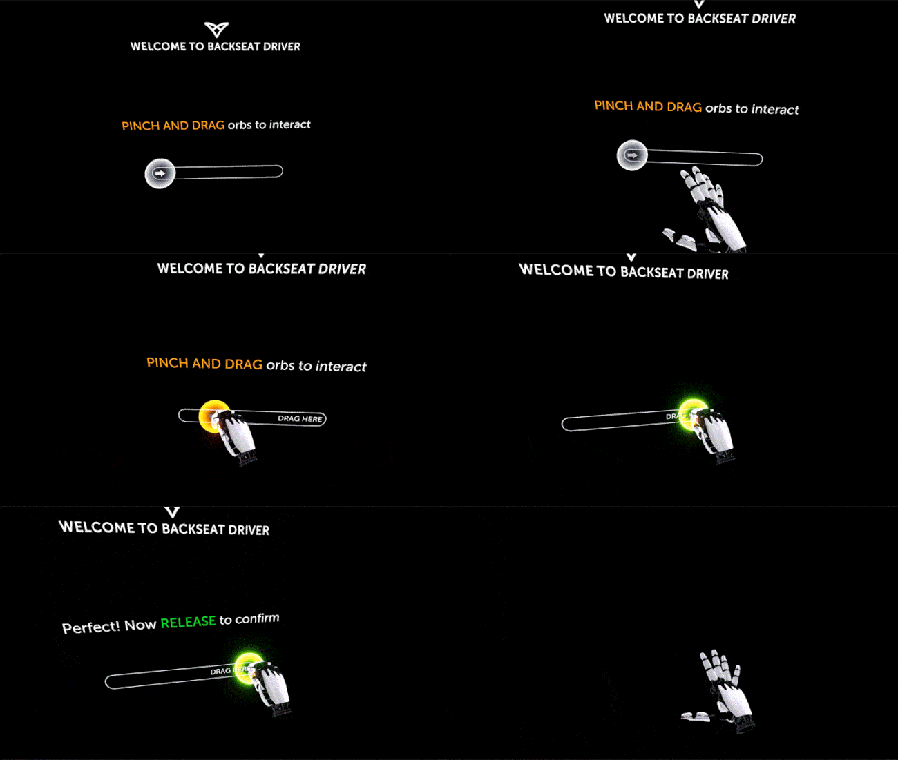
An interactive tutorial that teaches how to use a specific UI component. Because many UI components optimised for hand tracking can be three-dimensional in form and use gestures such as pinches and grabs, tutorials can be occasionally necessary to learn how to use them.
Through text and an optional voiceover, this tutorial prompts users to try a specific component, often presented in isolation - disabling any other interactions or elements until the tutorial is completed. When the pose is performed correctly, the tutorial gives clear feedback by - for example - showing a green indicator.
This tutorial can appear either at application start, or when introducing new chapters or sections where the pose will be used.
Character tutorial
Coming soon to Ultraleap XR plugins.
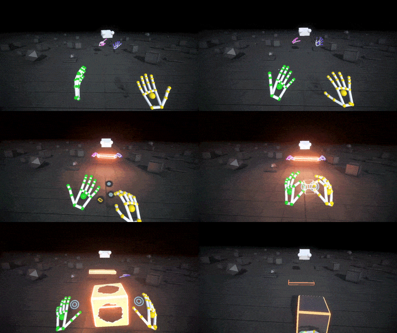
An interactive tutorial that teaches hand poses and other learned interactions, such as using a pinch gesture to draw in the air.
In this longer length tutorial, a character directly demonstrates new interactions, then asks the user to perform the action themselves. When they perform them correctly, clear feedback is given, preferably from the character. As we are all familiar with learning by observing others, this is a very grounded tutorial approach, suitable for those less experienced with VR.
The character is made using pre–recorded hands. This feature is coming soon to Ultraleap plugins.
This can be a longer sequence involving several steps for teaching several interactions. For that reason, it works best as an onboarding tutorial at experience start.
Design tips
Character tutorials work best when teaching interactions that are clear from a distance. Interactions using a small UI panel, or making a particular selection from a hand panel, are possible but require the character to be close enough to make the details apparent.
Characters can be very basic in appearance (such as in Ultraleap’s Blocks demo) and still be effective at communicating the correct movements.
Help panel
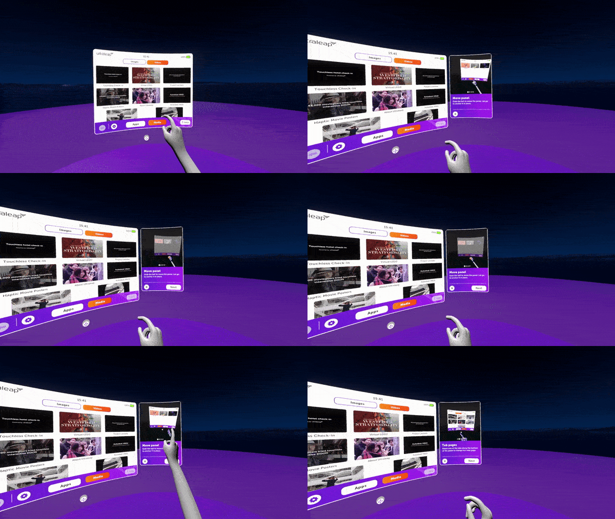
Ultraleap recommend always including a way for users to bring back tutorials whenever they need them, and access further help.
A small UI panel that demonstrates several interactions passively - via short animations - can be a very effective way to quickly recall several tutorials easily. In this example, the help panel appears alongside the main UI panel, and features a carousel component to swipe through animations.
Because help must be accessible at any time - including when users are confused or frustrated - it should not be activated by a learned interaction, but by a button or other familiar component which is within users’ field of view.