Design principles
When designing interactions for hand tracking careful consideration needs to be given to priority, usability, comfort, and reliability.
The most natural and effective hand interactions vary by type of application, and by factors such as frequency of use and user familiarity with VR.
Hands are also different to controllers, and Ultraleap do not recommend mapping controller interactions directly to equivalents with the hands. Instead, you can enjoy more of the benefits of using hands by following the principles below.
Make interactions physical
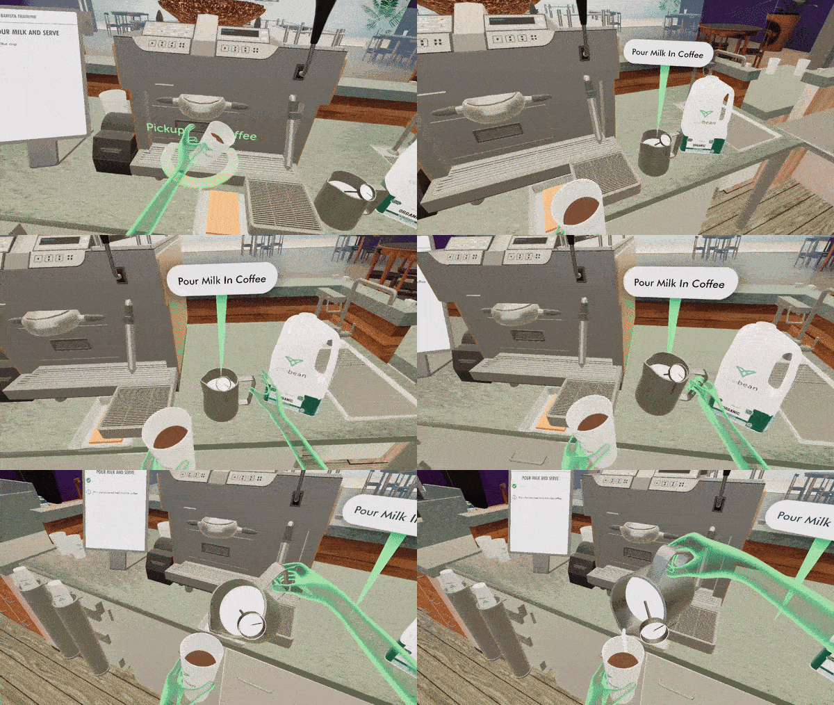
When we use hand tracking to interact with virtual objects and UI elements, we leverage a lifetime of physical experience with real objects, minimising the learning curve for new users.
When objects look three-dimensional and behave as one would expect from the real world, users will naturally manipulate objects with a broad range of push, pinch, and grab interactions that feel comfortable to them. They will also understand when objects move, slide, and fall in response to user actions, as one would expect. So, for example, users can easily pickup and stack objects with hand tracking without needing to learn or memorise new interactions.
This approach also extends to UI panels, which work best with hands when they have depth and physicality, as opposed to being flat and two-dimensional.
Want to learn more about implementing these features in the game engine of your choice? Check out the implementation guides:
Use poses sparingly
What is a pose?
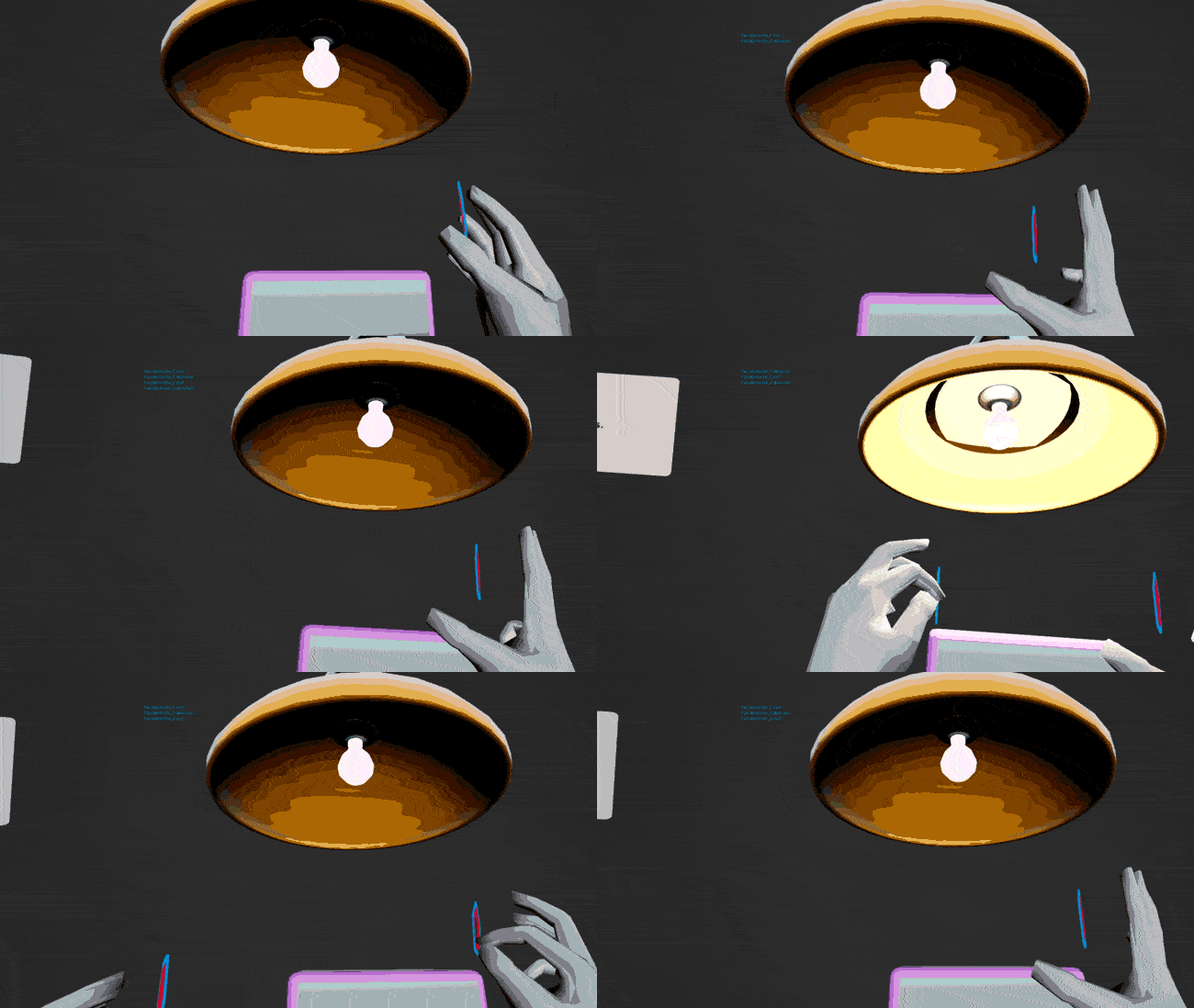
Users make a ‘pose’ when they hold up their hand in a distinct position in the air - for example, holding up a number of fingers or forming a ‘pinching’ pose. This can be recognised by Ultraleap hand tracking and trigger an action at any time, such as swapping mode or exiting the application.
This is an example of what we term a ‘learned interaction’ - as it will not be intuitive to users, and must be learned first, via some help or tutorial content.
Use poses sparingly
Ultraleap recommend using poses sparingly. They are rarely suitable for applications where users will have little time to onboard - such as training applications, requiring notable effort to learn and memorise. They work best when used for actions which are valuable to users - this makes them feel memorable and worth learning - such as triggering a system menu, accessing shortcuts or with social interactions, such as giving a thumbs up to a character to indicate a tutorial has been understood.
Poses can be appropriate to applications which users will spend more time and use often. They must always be taught by using a help panel or similar tutorial content.
Click here for more on poses.
Want to learn more about implementing these features in the game engine of your choice? Check out the implementation guides:
Provide extra feedback
Using hands is the most natural way to interact in VR, but without the tactile feedback we get from handling real world objects, it can sometimes be difficult to be sure we’ve grabbed something or pushed a button successfully.
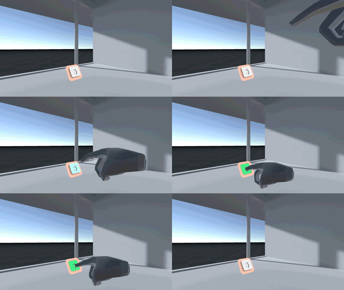
Through our research, we’ve found that this problem can be minimised by ensuring objects and UI components provide extra visual and audio feedback for user actions - for instance reacting to proximity of the hand, to focus and activation states with clear colour changes and sounds. When buttons are 3D and raised off a panel’s surface, users can even see them depress when fingers make contact, for additional clarity.
User confidence in performing interactions tends to increase with this clear feedback in place.
Another way to provide extra feedback is to add a haptic touch sensation, using an Ultraleap mid-air haptics device.
Design for comfort
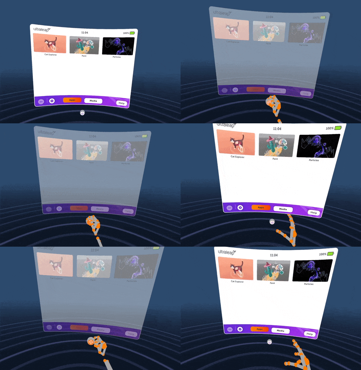
In VR - and especially with hands - users can be using their full body and interacting with more physicality than with screen applications. Poor design has the potential to cause discomfort, fatigue or even injury.
When creating your application keep user comfort in mind:
Minimise the need for the user to perform large and strenuous movements
Avoid users needing to hold hand poses for extended periods of time
Try not to have users raise the arm above the shoulder too often
Keep the need to fully extend the arm to a minimum
Ensure that frequently accessed objects and UI panels are positioned within easy reach and in clear view by default. When opening a UI panel or spawning an object, users should never have to look around to find it, or stretch to reach it.
Remember that how far users can reach, and what they find comfortable, can vary enormously. Always test your solution with as diverse a range of users as possible. Be prepared to reposition and resize components to ensure you cater for the widest possible range of people.
Design for the interaction zone
The Leap Motion Controller provides 140x120° typical field of view, with an approximate range of up to 80cm.
The Stereo IR 170 provides 170x170° and an approximate range of up to 100cm.
We call the active area where hands are tracked the interaction zone.
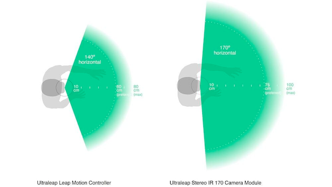
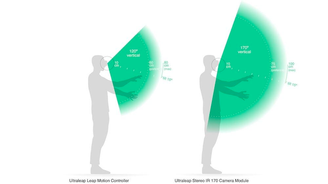
While both cameras provide a large and reliable interaction zone, for good design it helps to be aware of limitations. For example, if a user’s head is looking to the left and their hands are pointing to the right, then their hands may leave the camera’s field of view and hand tracking may be lost. Where possible, avoid interactions which require users to turn their head frequently or look in a different direction to their hands.

Similarly, interactions which require users to reach their arms to the limits of the interaction zone may both be uncomfortable and risk tracking being lost. When placing objects and panels, place them comfortably within the field of view and avoid the edges of the interaction zone wherever feasible.
Ultraleap also recommend communicating tracking loss to users by changing the visual representation of the hands - for example by fading as hands approach the limits of the interaction zone.
Design to avoid occlusion
Occlusion refers to instances where the Ultraleap camera does not have a clear view of a hand, and momentarily cannot track it properly. These moments are rare but they can happen in certain circumstances.
When one hand is directly between the other hand and the camera, this obscures a hand from the camera’s view. Ultraleap’s hand tracking software can support partial occlusion of the hands without issue. This allows UI components to be placed on hands and wrists - for example, a button on the palm of the left hand which spawns a UI panel when pressed. During the button press, the right hand covers part of the left hand.
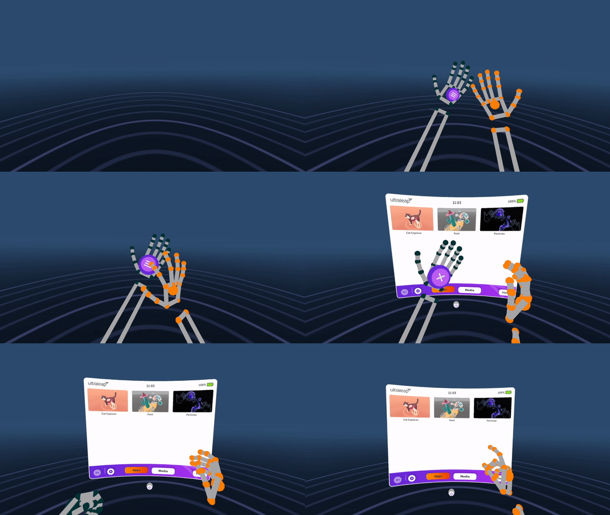
However, you should still avoid interactions which involve total occlusion, where one hand completely covers the other.
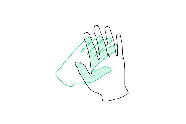
Additionally, at certain angles the arm and wrist can obscure some fingers from the camera’s view. To prevent this, do not spawn new objects or panels in the dead centre of the field of view, or directly behind users’ hands. Instead offset them slightly to one side of the FOV centre. This will ensure the best possible tracking.
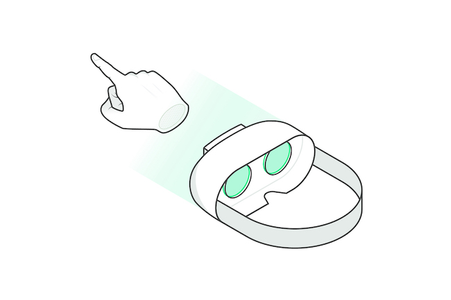
VR headset with pointing hand in centre of field of view
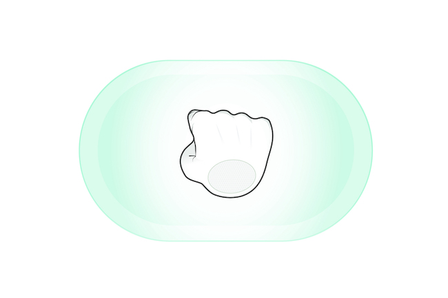
What the hand tracking camera sees

